Summary
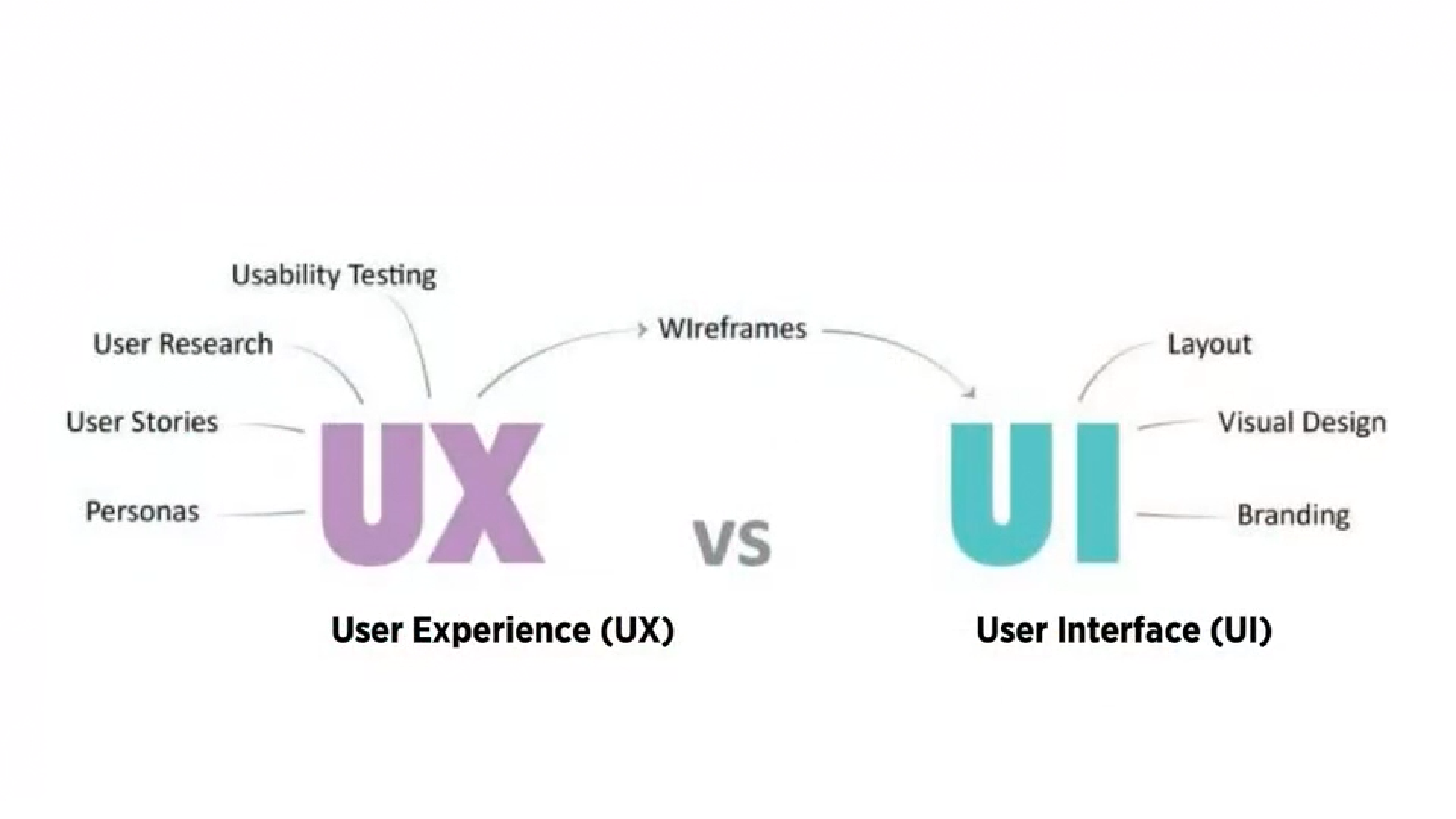
- UI design presents the user with the right tools to accomplish their goals. It is a connection between the user and the experience; the first impression
- Good UI Design should strive for a balance between aesthetics and effortless interactivity, well designed interfaces should guide the user through the experience
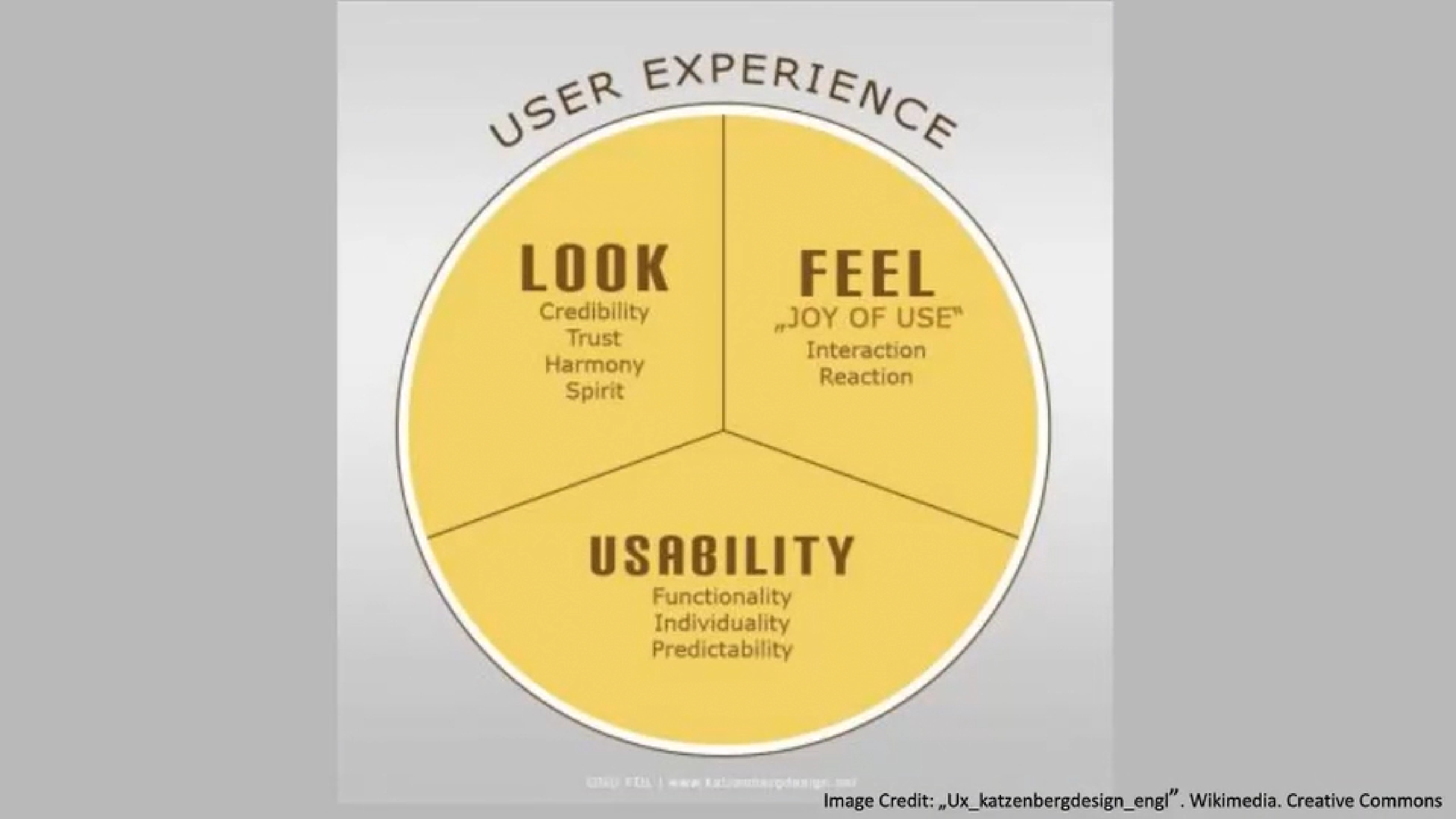
- User experience (UX) is the abstract feeling people get from the website. Could be whether it makes a lasting impression on them or if they found It helpful
UI is designed to heighten the user experience (UX).
Design Patterns
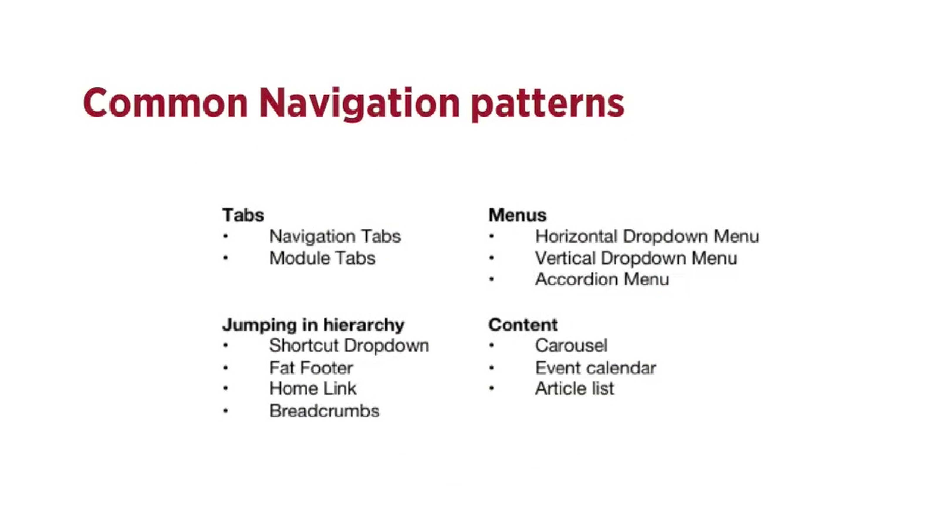
Design patterns are recurring solutions that solve common design patterns and are standard reference points.
Tabs
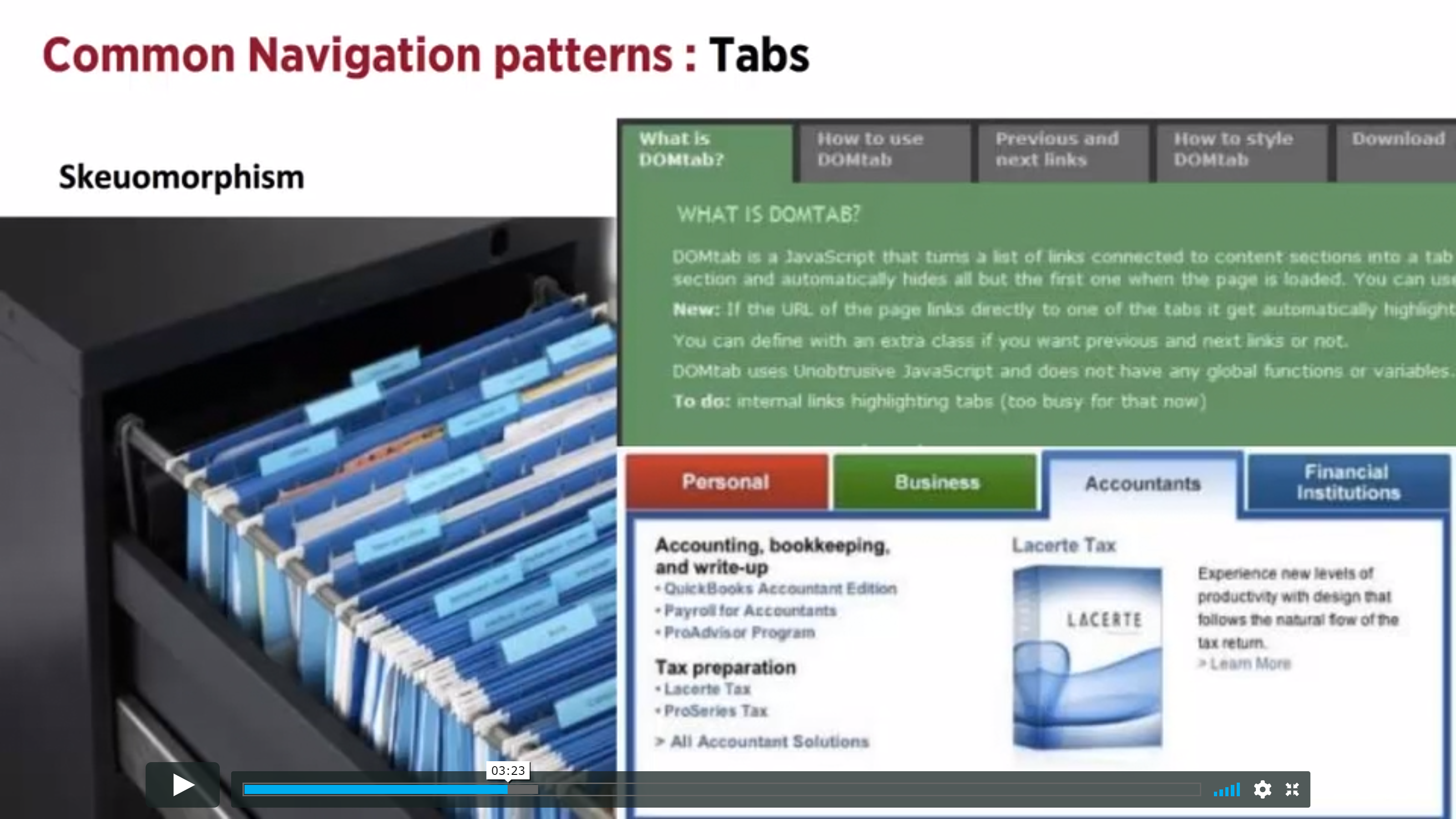
- Tabs are an extremely common navigation pattern and are derived from the real life example of actual tabs in a filing cabinet
- They can be seen as an example of skeuomorphism which is the design concept of making items resemble their real-world counterparts
Should be used when…
- Content needs to be separated into sections and accessed using a flat navigation structure that gives a clear indication of current location
- There is 2-9 sections of content that need a flat navigation mode
- Section names are short
- You want the navigation to fill the entire width of the page
- You want to provide a list of the highest available section or sub sections of the website
Shouldn’t be used when…
- You want to show content specific data, such as in websites like blogs where you want to display a different post each time
- There’s no need to single out the currently selected option
- The list of sections or categories call for a “more link”
Dropdown Menu
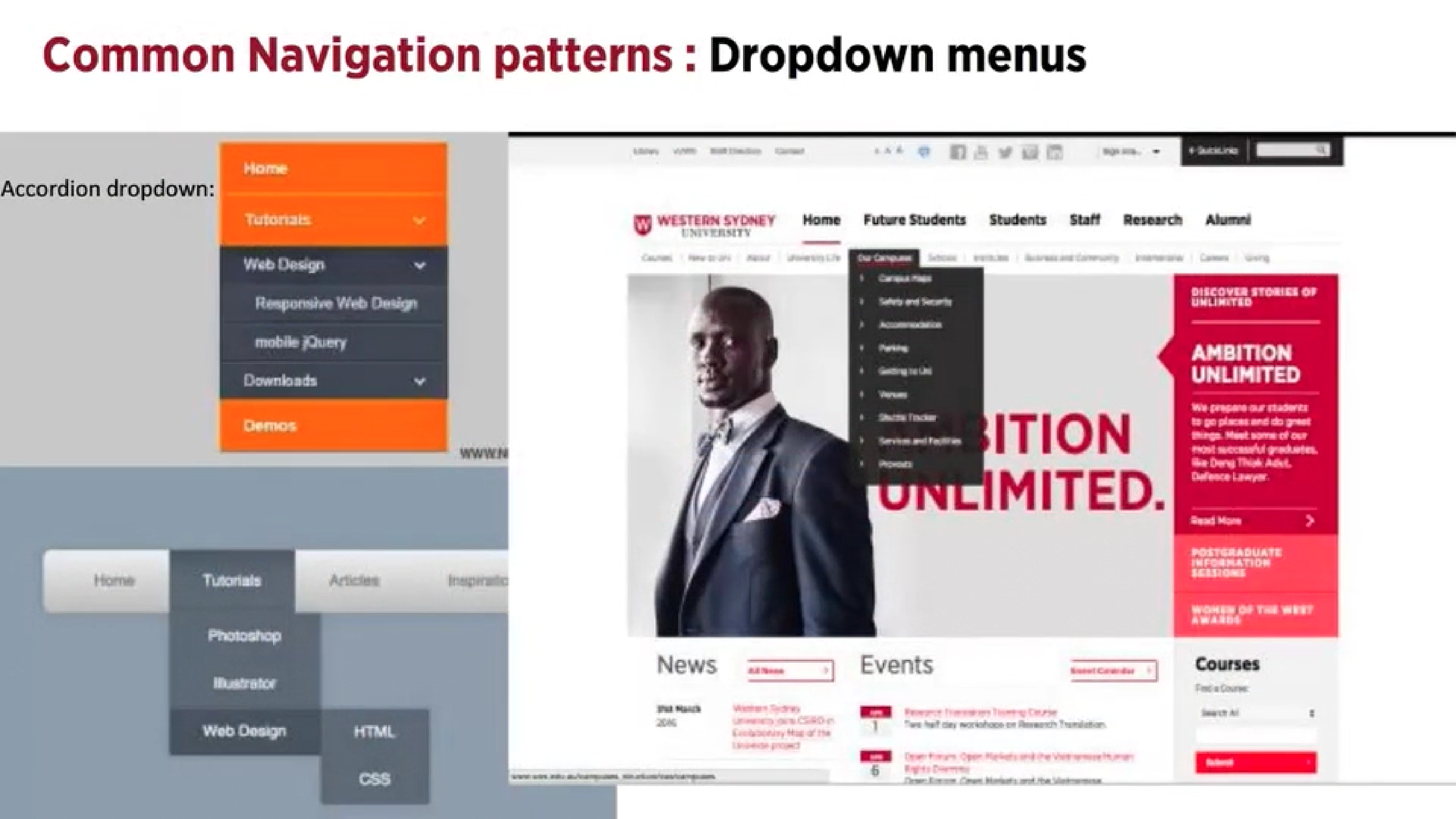
- Used when the user needs to navigate amongst the sections on a site
- They save space and conceal information
Should be used when…
- There are between 2-9 sections of content that need a hierarchical navigational structure
- Functionality resembles one of a desktop application
Shouldn’t be used when…
- There is a need to single out the location of the current item or section of the site, you would then use navigational tabs
Flyout Menus
- They save space and provide access to all the key menu items at once
Search Bar With a Dropdown

- Users can access a specific section or functionality of the website in a quick way regardless of hierarchy
- By adding a shortcut to the most frequently use functionality, the path can be shortened and the number of clicks lessened, and the confusion decreased
Should be used when…
- You need a shortcut to an otherwise hierarchical structure
- There are specific functionalities or pages that are more frequently used than other parts of a website and you would use the shortcut box to show these choices in order to shorten the path of the user
Big Footer
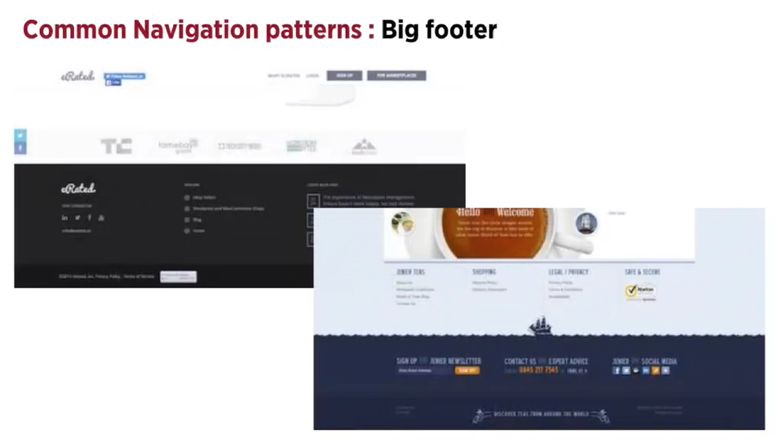
Should be used when…
- Users need a mechanism that will enable them to quickly access specific sections of a site or application and bypass the navigational structure you set up at the top
- You would want a shortcut to an otherwise hierarchical structure
- There are specific pages or functions that are more frequently used than other parts of the website
- You want to use shortcuts on different hierarchical elements of the page
Home Button
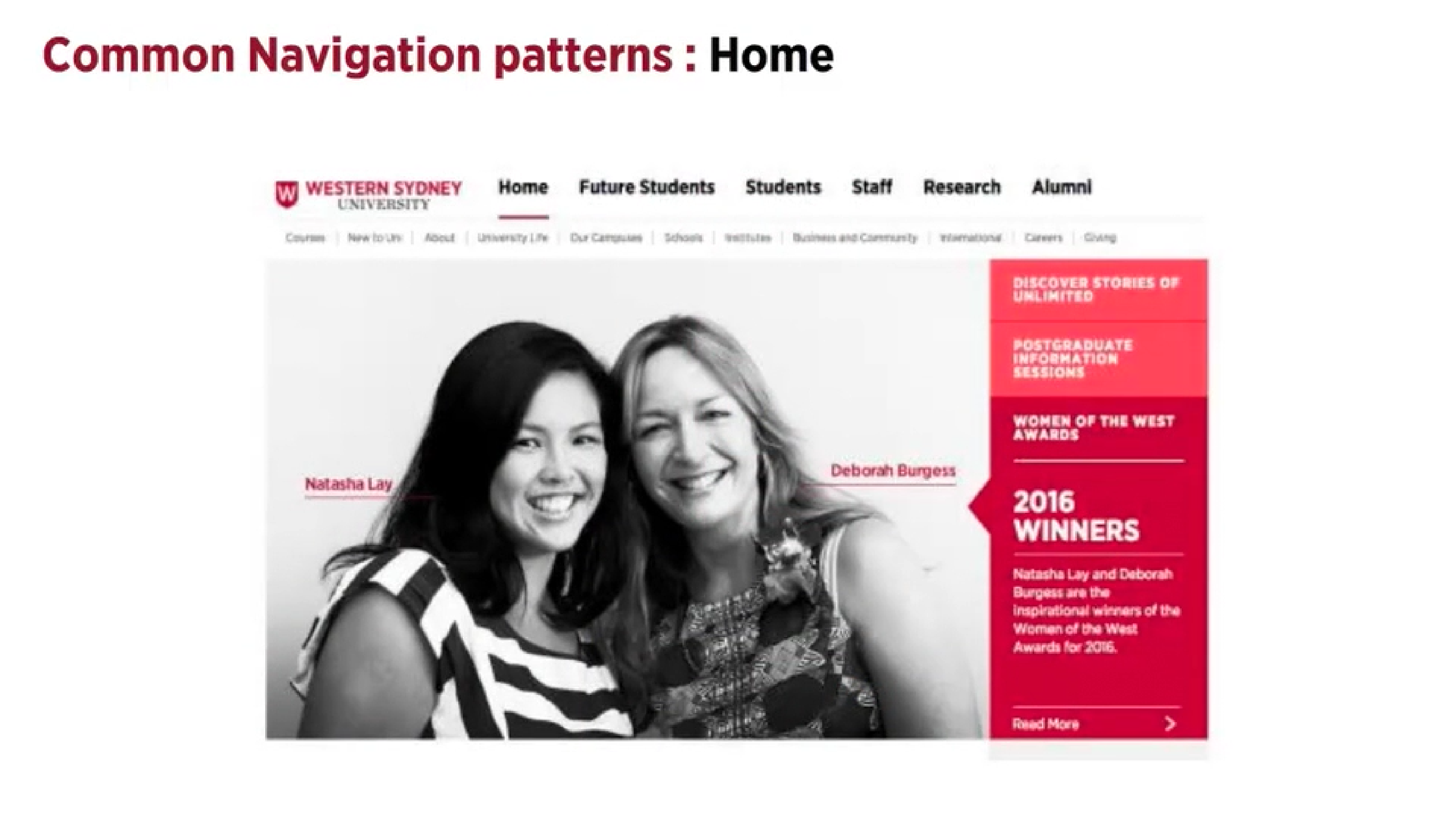
- Normally a front page of a site or section of a site
- Always use a home button or clickable logo
- The link should always be in the same location on all pages
Breadcrumbs
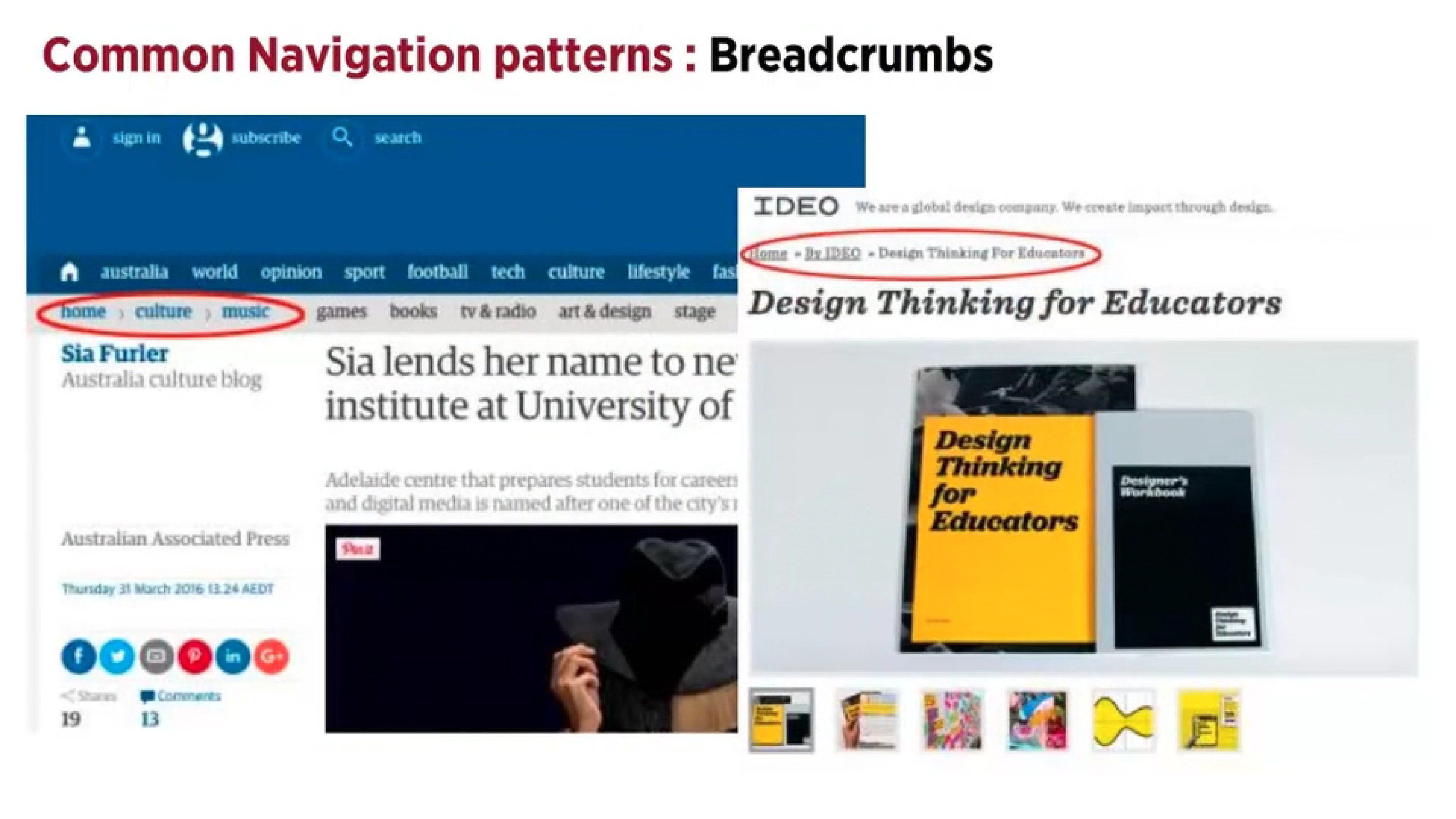
- Shows the user their location in the website’s hierachical structure in order to browse back to a level in the hierchy
- The sturcture of the website is more easily understood rather than when put into a menu
- They take up minimal space
Should be used when…
- The webiste follows a strict hierarchical structure of similar formatted content
- The structure of the site is partitioned into sections which can be divided into more sub-sections
- The user has landed onto the page from an external source like a blog
Shouldn’t be used when…
- You want this to be the main navigation or on the top level of the hierarchy e.g. on the home page
Reflection
This lecture pod was insightful as it taught be about the relationship between the UI design and Ux, user experience. Through showing how they should be used and how they shouldn’t increased my understanding and knowledge about them. Although these design patterns are more focused on UI design for websites and assessment 2 I chose to create a mobile game, I can use this information for future projects that involve websites.
