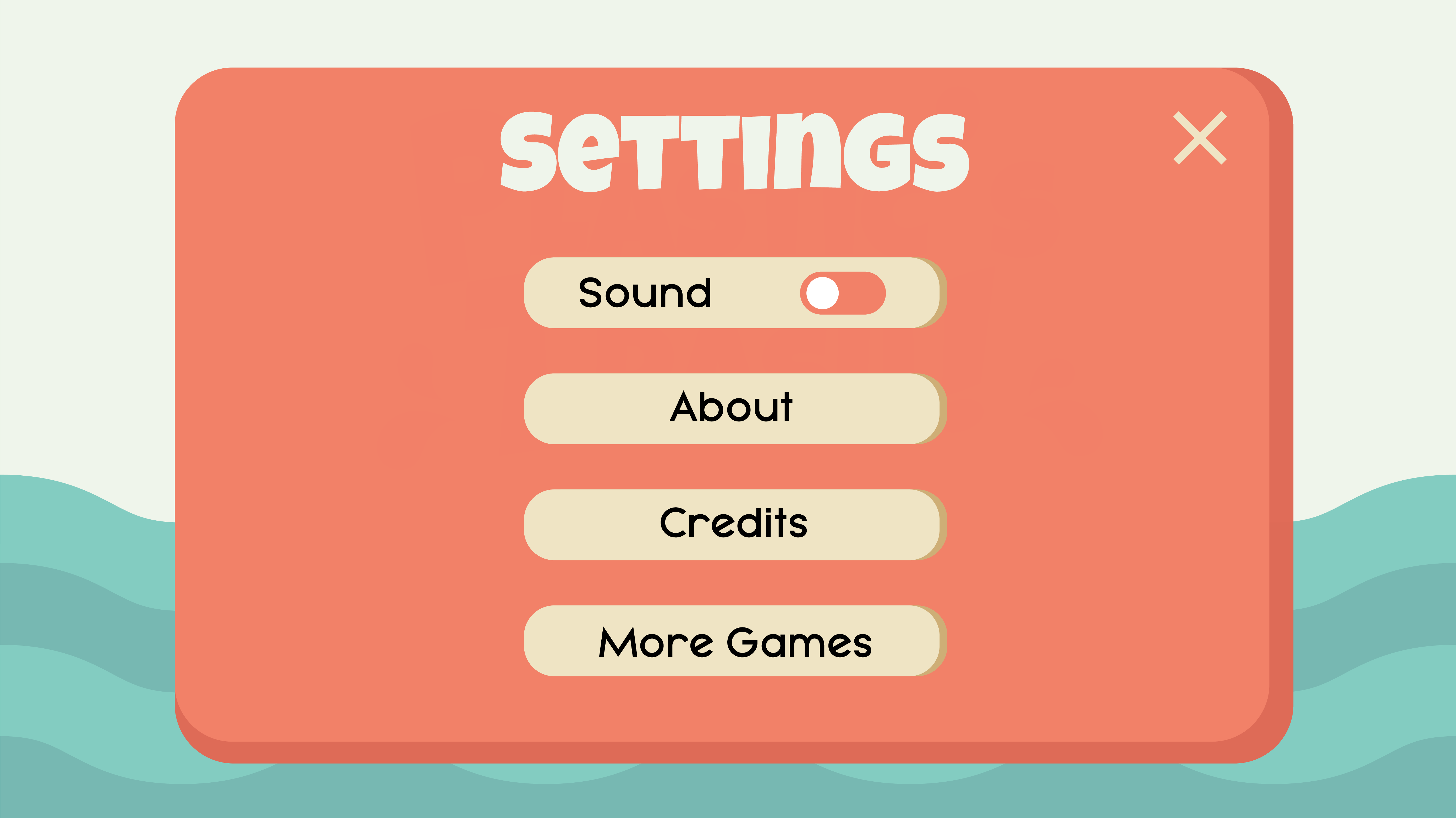
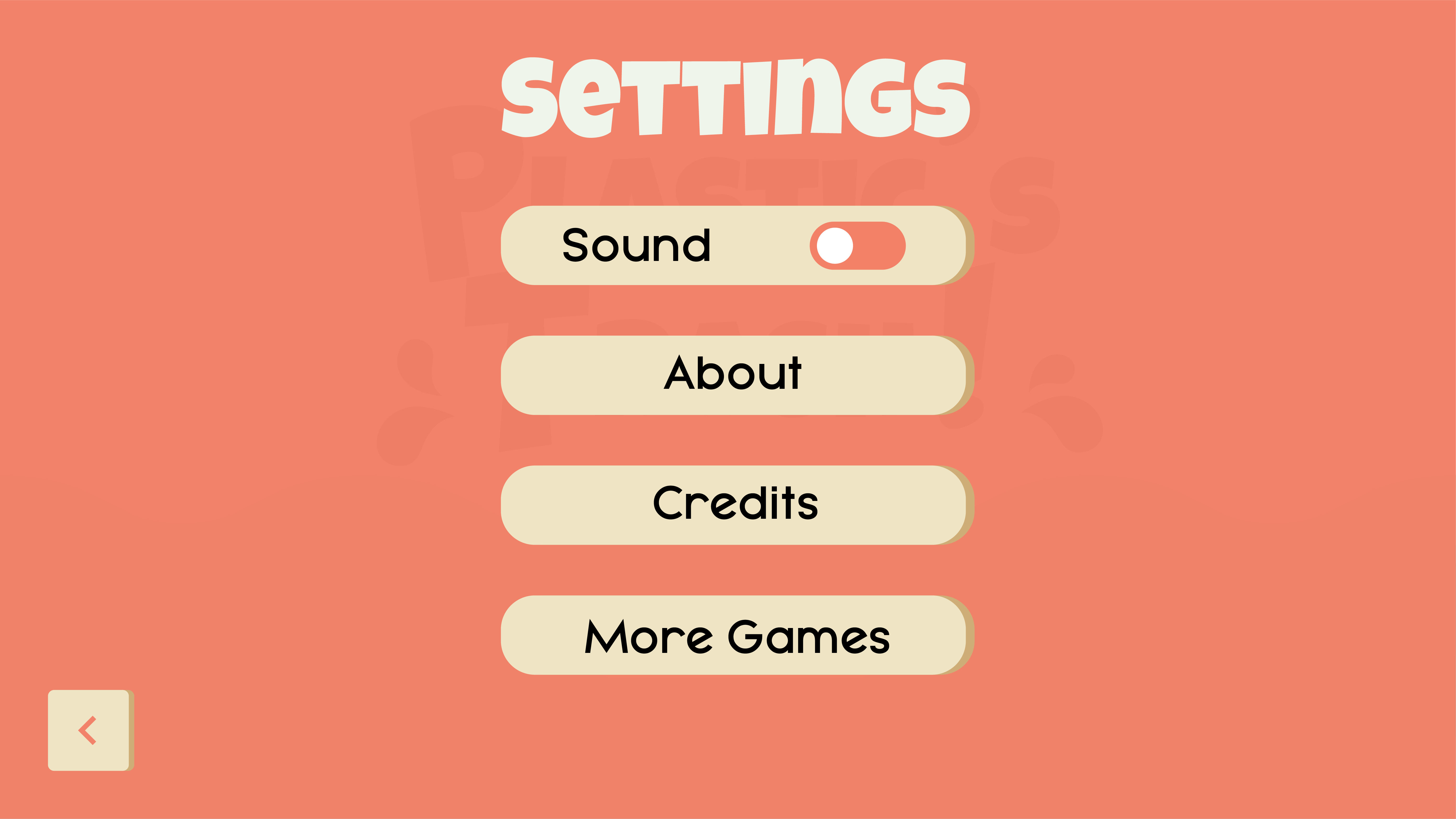
For this week’s class we were asked to create 3 variations/alternatives of one interface screen from our assessment 2 project.

Peer Feedback
Target Audience
- Easily identifiable
Look and Feel/ Visual Design
- Nice colours
- Very playful
- Simple layout for children to understand
- First screen overlaps (negative)
Navigational Elements and Layout
- Second screen is preferred as you can see the background as well as the settings menu overlay, great mix of both interactive 1 and 3
Colour Scheme
- Appeals to both genders of children
- Works well together
- Playful and fun
Overall Visual Identity
- Type and colour work well together
- Overall look works
- Addresses target audience well
