Interactive:
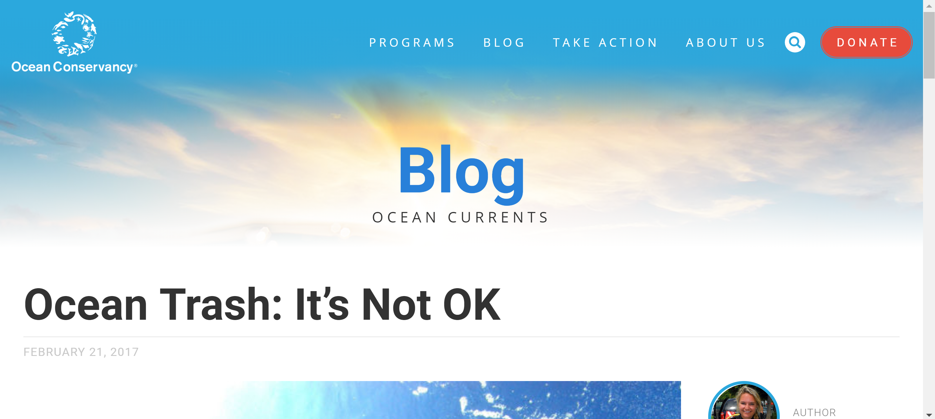
Ocean Trash: It’s not ok
What is the interactive about?
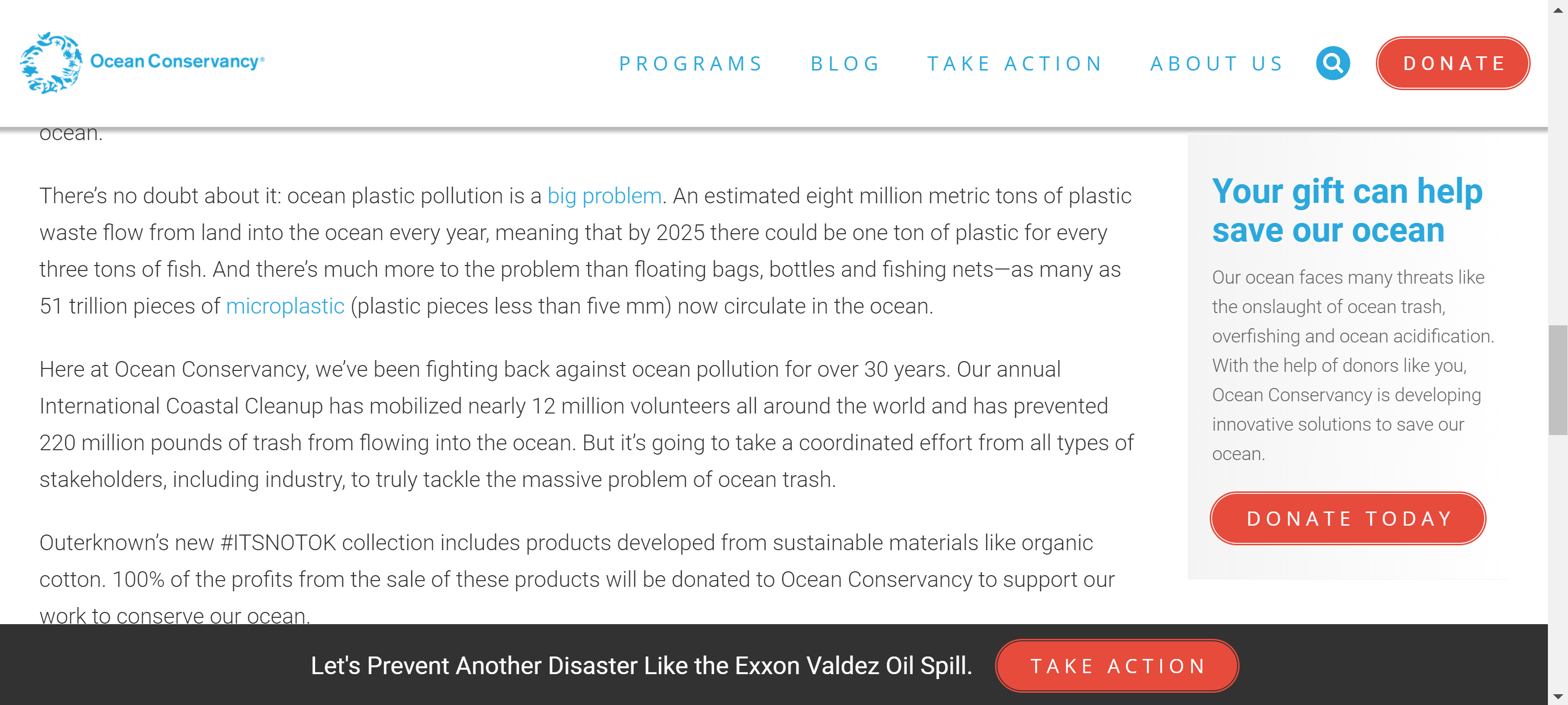
- Raises awareness about the marine trash and how it is an enormous environmental problem
- Encouraging and inspiring people to take action by cleaning the ocean from waste
- Is a blog/campaign which aims to find solutions for healthy oceans and to protect the wildlife that depends on it
- It also teaches the audience about the impacts of plastic on the ocean and how they can make a difference for the better
Who is it designed for?
- People who are interested in making a difference for the ocean
- Nature lovers
- People against littering
- Aimed at people aged around mid 20s-60+
What knowledge does it assume of the target audience i.e. digital literacy?
- It is opening the eyes of the public and their inappropriate actions of disposing rubbish in unacceptable places such as the streets.
- How waste negatively affects the environment and the importance of keeping the Earth clean
Describe the type of user interactions, and the user interface.
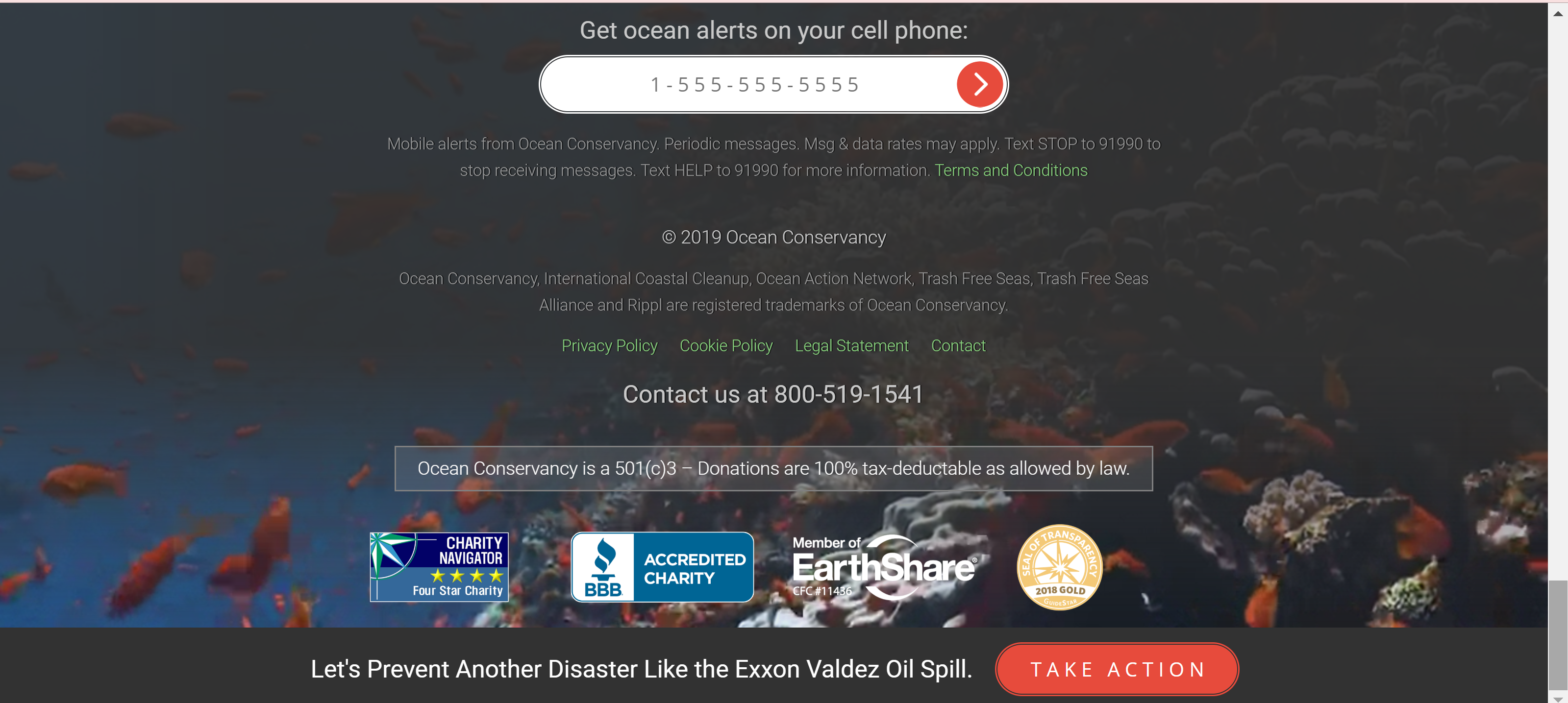
- Share the blog on social media (twitter, Facebook) and mail
- Receive ocean alerts from ocean conservancy on your phone
- Phone number available to further understand information about the issue
- A call to action, “DONATE” in the top right-hand corner in a noticeable red coloured button against the blue coloured theme of the rest of the page
- There is also a “take action” button in the sticky footer, and another “donate” button on the side, next to the article
- The nav bar at the top has some sections that drop down giving further information and more links, making it easier for the user to find where they are wanting to go on the website
What can you say about visual design – layout, colour, and typography? How would you describe the style?
- The visual design is based quite well as the colour blue and white are the main colours displayed throughout the blog.
- The blog has a simple but effective layout which makes navigating around easy
- images of the ocean and marine life are present which sticks well to the marine theme
- Typography is clean and simple and easy to read (san serif), which makes reading body copy easy.
- The images appear above and below the text which add to the message but do not distract from the writing